The older I am the more I appreciate ornamental UIs in games
Limp-Grapefruit-6251
I loved the Halo 5 UI which differs depending on the spartan you’re playing as in the campaign (they have different helmets), it was so immersive ngl, I wish they would bring back that feature
TheAkrioz
I hate that destiny-like equipment menu and a CURSOR on a CONSOLE.
Sometimes I see a new game and then they open a menu, I see that equipment screen for the Nth time and just roll my eyes. Also, that along with color coded rarity(which is a good thing by itself) are like the staples of live service games and it doesn’t help my perception. Too many games are trying to shoe-horn an unnecessary and unispired looting system nowadays.
Hawkmoon_
I played the Resident Evil 2 remake recently. And while I really like it, the menu is boring af.
pulyx
Look, taste is personal and stuff, not judging or anything.
That said: this mall-ninja aesthetic is fucking disgusting hahahahahahaha
Mystrasun
I’m kind of in two minds about it. On the one hand, I love the artistry behind UI elements and back in the day I loved how they tied thematically to the games I played. That said, now that game graphics continue to get better, and the type of games I’ve played have generally moved towards RPGs with amazing worldbuilding and environmental storytelling, I’ve come to appreciate unobtrusive UI that lets me appreciate the game world as much as possible.
It shows up when there’s pertinent information like gaining XP or looting something, then goes away again so I can go back to being immersed. I tend to favour that kind of UI more these days
Kerokai
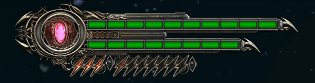
What the hell is that UI from I recognise it and cannot place it
SurvivalK
The health UI being displayed on the back of Isaac’s RIG in Dead Space is my all time favourite.
Live monitoring of health, stasis, air supply, etc. all on the back of your player character’s suit. Perfect for immersion.
HonestStupido
I really like how Metal Gear games did it, they were pretty clean yet memorable and had distinct style
Witty_Elephant5015
Devil May cry 3, 4 and 5 have really good health meters.
I also like the Health meters in prince of Persia 1, 2 and 3 as well.
astrielx
Cool and unique is great if they actually look good. That’s the main issue, so many games try to make flashy uis that are just way too over the top.
It’s basically Cool – Unique – Good. Pick 2.
CallSign_Fjor
Boring and clean comes across as “easy to read.” This is just clutter.
Handsome_Warlord
Does anyone remember the life bar from Sword of Sodan?
It’s been 30 years and I still don’t know what that thing is meant to be!
CorvusCorax90
I think the atlus games have interesting ui‘s. The new metaphor re phantazio definitely has. Its a bit much at the start but as you get used to it, it becomes very stylish.
Buuhhu
yeah we lost a lot of originality and flavor in favor of “visual clarity” or “clean” UI.
I like the halo and metroid prime visor UI. And probably one the best is Dead Space all in universe UI.
InternationalOne2449
I miss those fancy 3D title screens
RestardedMan
Deadlock has a unique UI and it’s still in alpha
J_I_W
Depends on the game. Sometimes a red line for health and green for stam is all you need
Age_5555
I think it is because of the modern flat design diffusion, also, new games and especially big ones use simple and minimum HUD to enhance immersion. But I too miss some over-the-top designs which are still badass. Asura’s Wrath whole UI was insane!
GodzillaUK
and this display is from…?
yaryarmaple
Strongly agree. The UI and HUD can make or break a game experience for me and I can’t for the life of me understand why developers don’t put more effort into it. Not in game development, but seems like an efficient use of resources when as the player, we spend 95% of our time looking at it
Pollo_Jack
The creep of empty space on game UIs makes me feel like I’m playing through an excel spreadsheet.
DiabeticRhino97
See blasphemous
whiskerbiscuit2
Personally I’m a fan of the “invisible HUD” most games use. Y’know where your health bar only shows when you’re taking damage, and then it disappears. The less text and bars and crap on my screen the better
WeebMaker
God of wars hud was dope.
Baruuk__Prime
I couldn’t agree any more on that, even if I tried. Warframe & CONTROL are stand-out examples of maximum boring when it comes to status bars and UI elements. Today’s flatness has to end!
RuySan
I do remember plenty of game critics praising Skyrim’s UI when the game was released because it was “clean” and “modern”. Skyrim still feels very ornamental compared to what came after, but it was a huge downgrade at the time. Compare it to Oblivion UI that feels an old book.
kliperek505
The worst is garbage like Destiny 2 and No Mans Sky. Looks like a damn template.

28 Comments
The older I am the more I appreciate ornamental UIs in games
I loved the Halo 5 UI which differs depending on the spartan you’re playing as in the campaign (they have different helmets), it was so immersive ngl, I wish they would bring back that feature
I hate that destiny-like equipment menu and a CURSOR on a CONSOLE.
Sometimes I see a new game and then they open a menu, I see that equipment screen for the Nth time and just roll my eyes. Also, that along with color coded rarity(which is a good thing by itself) are like the staples of live service games and it doesn’t help my perception. Too many games are trying to shoe-horn an unnecessary and unispired looting system nowadays.
I played the Resident Evil 2 remake recently. And while I really like it, the menu is boring af.
Look, taste is personal and stuff, not judging or anything.
That said: this mall-ninja aesthetic is fucking disgusting hahahahahahaha
I’m kind of in two minds about it. On the one hand, I love the artistry behind UI elements and back in the day I loved how they tied thematically to the games I played. That said, now that game graphics continue to get better, and the type of games I’ve played have generally moved towards RPGs with amazing worldbuilding and environmental storytelling, I’ve come to appreciate unobtrusive UI that lets me appreciate the game world as much as possible.
It shows up when there’s pertinent information like gaining XP or looting something, then goes away again so I can go back to being immersed. I tend to favour that kind of UI more these days
What the hell is that UI from I recognise it and cannot place it
The health UI being displayed on the back of Isaac’s RIG in Dead Space is my all time favourite.
Live monitoring of health, stasis, air supply, etc. all on the back of your player character’s suit. Perfect for immersion.
I really like how Metal Gear games did it, they were pretty clean yet memorable and had distinct style
Devil May cry 3, 4 and 5 have really good health meters.
I also like the Health meters in prince of Persia 1, 2 and 3 as well.
Cool and unique is great if they actually look good. That’s the main issue, so many games try to make flashy uis that are just way too over the top.
It’s basically Cool – Unique – Good. Pick 2.
Boring and clean comes across as “easy to read.” This is just clutter.
Does anyone remember the life bar from Sword of Sodan?
It’s been 30 years and I still don’t know what that thing is meant to be!
I think the atlus games have interesting ui‘s. The new metaphor re phantazio definitely has. Its a bit much at the start but as you get used to it, it becomes very stylish.
yeah we lost a lot of originality and flavor in favor of “visual clarity” or “clean” UI.
I like the halo and metroid prime visor UI. And probably one the best is Dead Space all in universe UI.
I miss those fancy 3D title screens
Deadlock has a unique UI and it’s still in alpha
Depends on the game. Sometimes a red line for health and green for stam is all you need
I think it is because of the modern flat design diffusion, also, new games and especially big ones use simple and minimum HUD to enhance immersion. But I too miss some over-the-top designs which are still badass. Asura’s Wrath whole UI was insane!
and this display is from…?
Strongly agree. The UI and HUD can make or break a game experience for me and I can’t for the life of me understand why developers don’t put more effort into it. Not in game development, but seems like an efficient use of resources when as the player, we spend 95% of our time looking at it
The creep of empty space on game UIs makes me feel like I’m playing through an excel spreadsheet.
See blasphemous
Personally I’m a fan of the “invisible HUD” most games use. Y’know where your health bar only shows when you’re taking damage, and then it disappears. The less text and bars and crap on my screen the better
God of wars hud was dope.
I couldn’t agree any more on that, even if I tried. Warframe & CONTROL are stand-out examples of maximum boring when it comes to status bars and UI elements. Today’s flatness has to end!
I do remember plenty of game critics praising Skyrim’s UI when the game was released because it was “clean” and “modern”. Skyrim still feels very ornamental compared to what came after, but it was a huge downgrade at the time. Compare it to Oblivion UI that feels an old book.
The worst is garbage like Destiny 2 and No Mans Sky. Looks like a damn template.