
I know a lot of people wish BO3's HUD was more like BO2's in the sense that each map had a unique style of HUD, and don't get me wrong I really loved BO2'S varied HUD's as well, but I also really respect the minimalistic approach of BO3's.
However, I do wish there were some slight adjustments on each map's HUD that carried the same minimalistic approach, just with a thematically fitting flair.
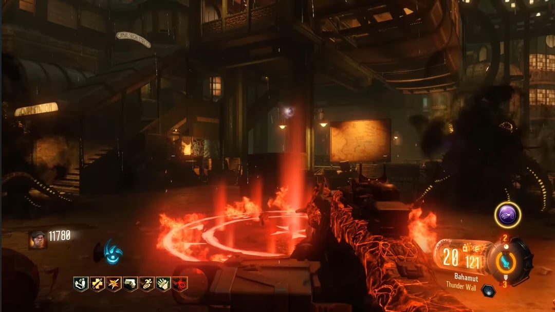
Shadows of Evil's HUD being red is so cool. The Giant, Origins, Revelations and Der Eisendrache's being blue is also very cool.
It would've been so nice on the eyes if Zetsubou, Shi no Numa, Shang, and Moon had a green tint.
I also feel like Verruckt and Gorod should've shared the red HUD with Shadows, it feels thematically appropriate for those maps imo.
This is a lot more work than necessary for a HUD, but it would've been so sick if Ascension's was bland and washed out until the power turned on and brought color to everything.
Imo, the blue doesn't fit Nacht or Kino, but I don't really know what would.
1 Comment
Is it possible that the HUD color just represents the crew you are playing as?